NYC 311 requests follow the calendar, not the weather
NYC’s 311 app lets you report overgrown grass or weeds in public spaces. I analyzed 15 years of service requests tagged as Grass/Weeds to predict weekly volumes. Machine learning models improve accuracy, but weekly averages are simpler to implement and appropriate for operational planning.
What do New Yorkers report?
NYC’s 311 platform is where residents report non-emergency issues like damaged trees, potholes, broken streetlights, noise complaints, and so on. Requests are routed to the relevant city agency for follow up. Since 2010, NYC 311 has routed over 1.6 million service requests to the Parks and Recreation Department. Over 21,000 of these were about overgrown grass and weeds in public green spaces. Other cities have similar systems, like SF311 in San Francisco or Minneapolis 311.
Here’s a table of the top NYC 311 service requests in 2024 routed to the NYC Parks Department. The most common requests are related to urban trees.
| Rank | Service request | Count in 2024 |
|---|---|---|
| 1 | Damaged tree | 31,721 |
| 2 | Maintenance or facility | 26,237 |
| 3 | Overgrown tree/branches | 22,147 |
| 4 | New tree request | 21,010 |
| 5 | Root/sewer/sidewalk condition | 10,538 |
| 6 | Dead/dying tree | 10,002 |
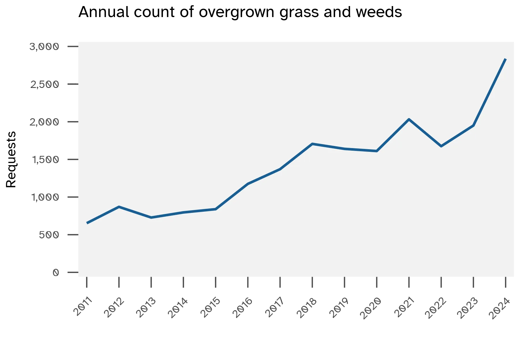
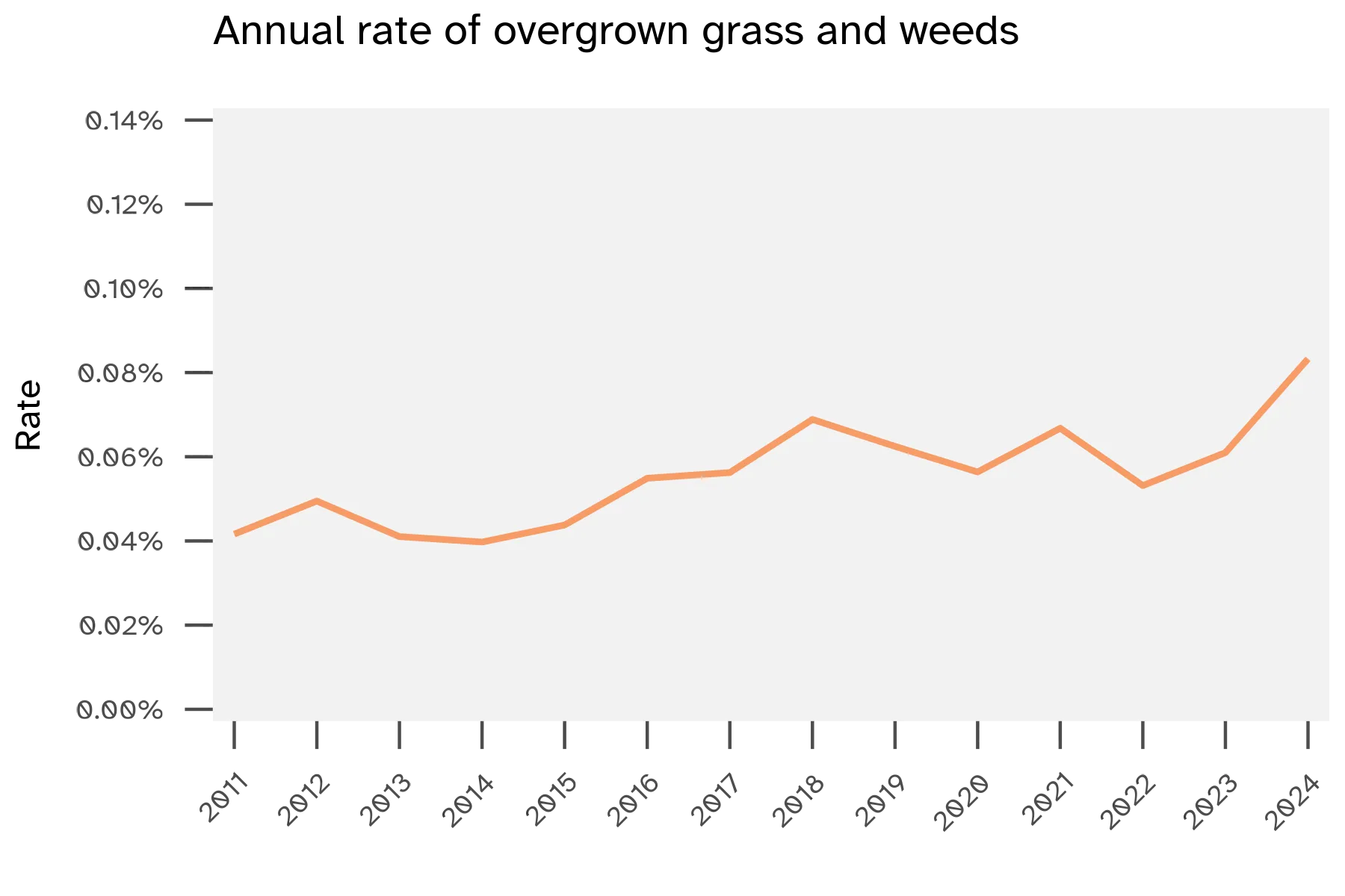
Grass/weeds requests are a small subset of the Maintenance or facility category. While the raw count of grass/weeds service requests has increased over time, the rate of grass/weeds requests stayed consistent year over year. This shows more people are using the 311 platform, and grass/weeds requests remain a relatively stable concern.
Modeling results
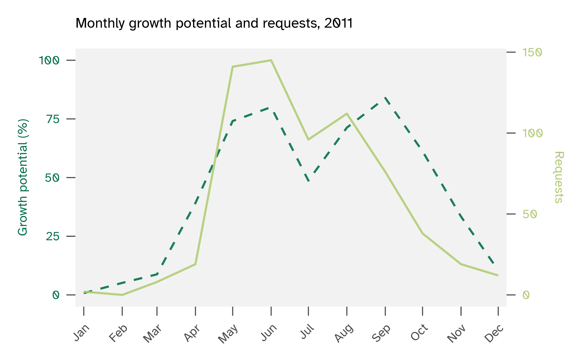
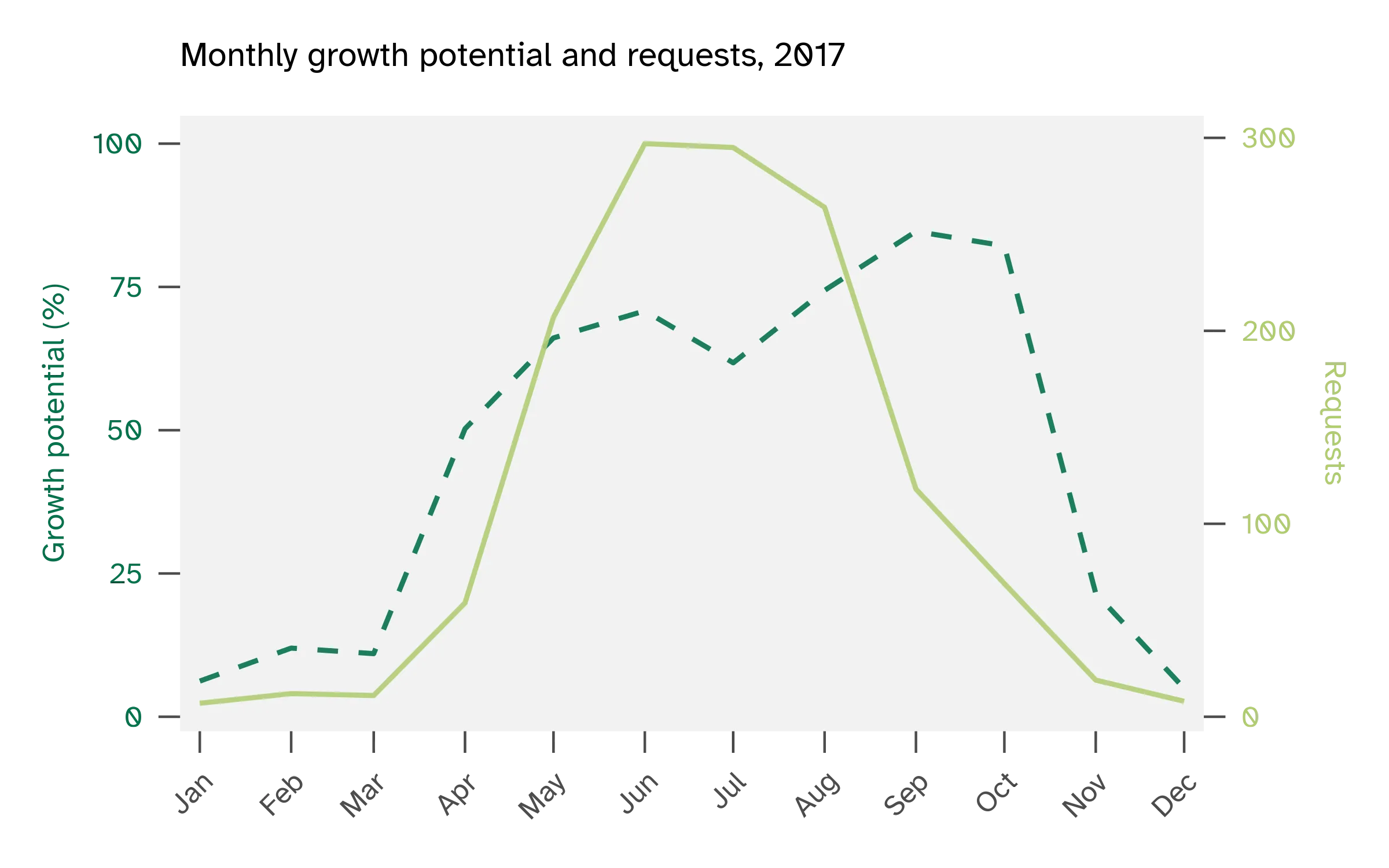
I wanted to try predicting weekly service request counts using temperature, turfgrass growth potential, growing degree days, precipitation, weather anomalies, and seasonal features like week of year. Look at these figures of cool-season turfgrass growth potential vs service requests. A year like 2011 aligns with growth potential, whereas a year like 2017 does not.
First I tested a statistical model (negative binomial regression) and then went to a machine learning model (random forest). The weekly data from 2010-2022 was used for training and 2022-2025 for testing. For a baseline comparison, I used weekly averages of grass/weeds service requests with no weather predictors.
The negative binomial model achieves a mean absolute error (MAE) of 17.7 service requests per week, compared to 18.1 for the weekly average baseline. This means the model’s average miss is 17-18 service requests per week.
I built a random forest model with 48 predictors. This model achieved an MAE of 10.0 service requests per week. The most important feature, by far, was the previous week’s requests. I set up another random forest that excluded the previous week requests. This model achieved an MAE of 13.3, with temperature normals as the top feature.
| Model | Type | Description | MAE | Top features |
|---|---|---|---|---|
| Seasonal naïve | Baseline | Weekly averages | 18.1 | Week of year |
| Negative binomial | Statistical | Handles count data | 17.7 | Previous week requests, week of year |
| Random forest | Machine learning | 48 predictors | 10.0 | Previous week requests |
| Random forest | Machine learning | 46 predictors, no lag features | 13.3 | Temperature normals |
Yesterday predicts today
Service request history plus seasonality drive most of the signal. In the full random forest model, most of the predictive power comes from last week’s service requests and what week of the year it is. Weather, temperature, and growth potential contribute little when you have those two predictors.
When I removed the lagged requests to force the model to rely on weather, the top feature was temperature normals, not actual observed temperature. Temperature normals are climatological averages with a smooth seasonal distribution, essentially another proxy for time of year rather than live weather data. So, even the weather-only model leans on seasonal patterns more than real-time conditions.
This is Pretty Obvious Stuff. If lots of people sent requests last week, lots will send requests this week. Summer is busier than winter. Week-to-week momentum matters.
Extreme weeks are hard to predict
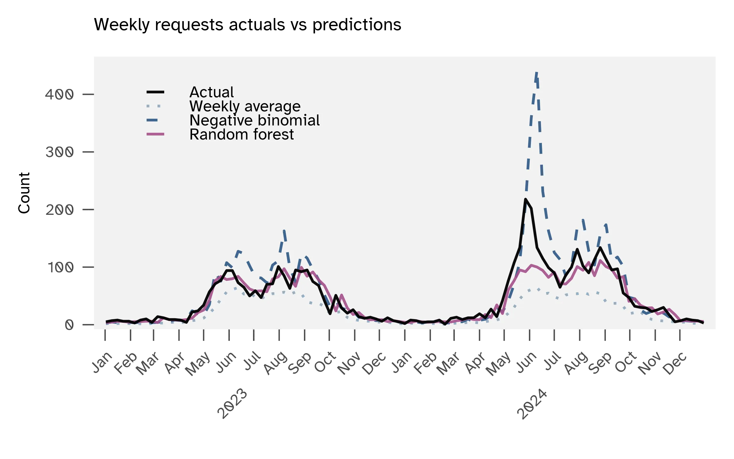
The random forest model (with all predictors and MAE 10.0) performs differently across service request volumes. For quiet weeks with 10 or fewer actual requests, the model averages 2.4 service requests off. For moderate weeks with 26-100 requests, the average error is 11-12 service requests. The model struggles with extreme weeks above 100 service requests. The average error jumps to 39. High-volume weeks are rare in the training data, so the model hasn’t learned these spikes well.
Relative error is the absolute error divided by the actual value for each prediction, then averaged across all predictions. Low-volume weeks have high relative error (61% for 10 or fewer service requests) because small misses inflate the percentage. Mid-to-high volume weeks (51-100 service requests) have the lowest relative error at 17%, while extreme weeks above 100 service requests see relative error rise to 26%.
| Volume bin | Mean requests | MAE | Mean relative error |
|---|---|---|---|
| 0-10 | 6.2 | 2.4 | 61% |
| 11-25 | 15.9 | 7.2 | 46% |
| 26-50 | 35.4 | 11.6 | 33% |
| 51-100 | 75.1 | 12.0 | 17% |
| 100+ | 133.8 | 39.0 | 26% |
Keep it simple for planning
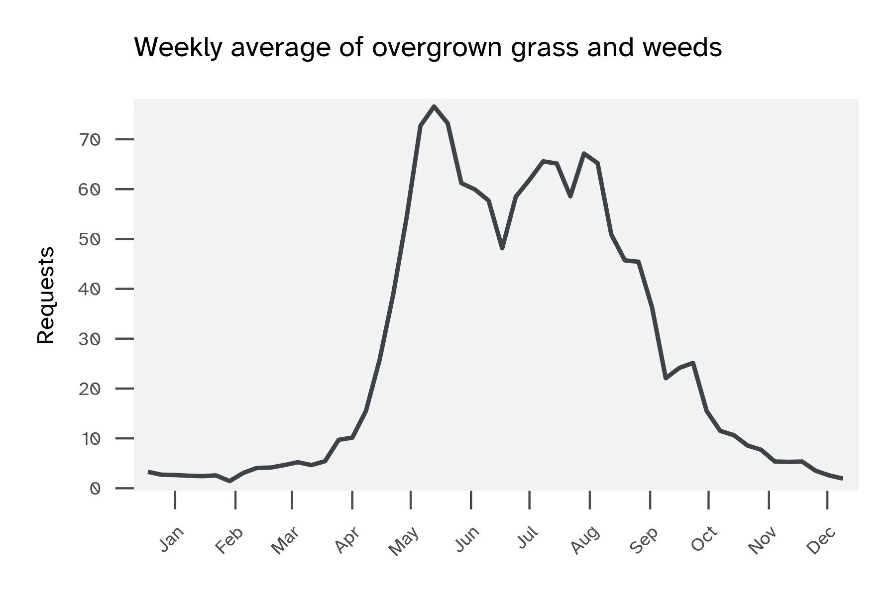
For operational planning, use historical weekly averages as a seasonal calendar. This simple approach usually gets you within 15-20 requests per week and requires no live data collection. Service requests follow predictable seasonal peaks from May through September, with weekly averages climbing from around 20 requests in early spring to 80-100 requests during peak summer.
The weekly averages will underestimate rare extreme spikes. The machine learning models reduce that prediction error, but they do so primarily by using the previous week’s service requests, not weather. Maintaining weather data pipelines is complex and the model improvement does not justify the operational overhead. A simpler implementation could be handled in spreadsheets using historical weekly average + last week’s actual requests + week of year.
Human factors in reporting
Geographic patterns in the grass/weeds data appear scattered and random, to me. Here’s a map of the total annual requests by zip code. Nothing in the distribution seems related to turfgrass conditions or microclimates. It could be about who lives in a given zip code.
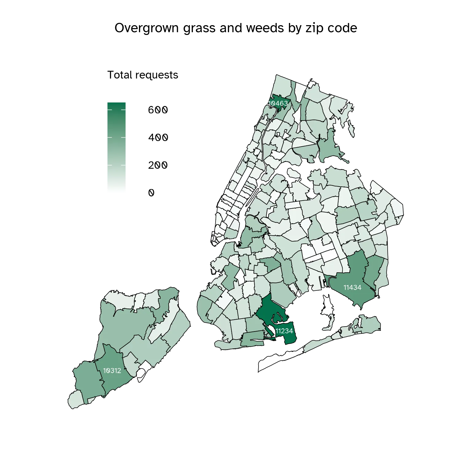
Others have written about how NYC 311 data reflects who reports rather than where conditions are objectively worse. Power users are typically more affluent residents who are comfortable using 311 to report issues. Gentrifying neighborhoods likewise see increases in per capita complaints as demographics shift, reflecting differences in reporting behavior rather than actual changes in conditions.